前言
关于css技巧类的文章,我前面也写过很多,例如提高你css技能的css开发技巧 、css表单样式美化、css对话框的写法、css中伪元素before或after中content的特殊用法attr 等等,这些都是一些使用技巧。今天,我再列举一些平时工作中,可能遇到的题目,并写出其css解决方案。
多列等高布局实现方式
何为多列等高布局?如下图这样
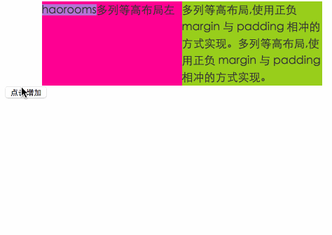
点击增加一侧文字,另一侧背景也增加。
html代码:
<div id="container">
    <div class="left">haorooms多列等高布局左</div>
    <div class="right" id="rights">多列等高布局,使用正负 margin 与 padding 相冲的方式实现。</div>
</div>
方法一: 使用正负 margin 与 padding 相冲的方式实现
    #container{
    width:400px;
    margin:0 auto;
    background:#eee;
    overflow:hidden;
}
.left,
.right{
    width:200px;
    float:left;
    font-size: 16px;
    line-height:24px;
    color:#333;
    padding-bottom:5000px;
    margin-bottom:-5000px;
}
.left{
    background-color: deeppink;
}
.right{
    background-color:yellowgreen;
}
给一个足够大的padding和负margin
二、使用 display:flex 的方式实现
这个方式很简单,移动端我们经常用,container 设置为display:flex,子元素设置为flex:1就可以了。
三、display:table-cell 实现
和上面方法类似,container 设置为display:table;,子元素设置为display:table-cell;就可以了。
四、 父容器设置背景色实现
如下:
#container{
    width:400px;
    margin:0 auto;
    background-color: deeppink;
    overflow:hidden;
}
.left,
.right{
    width:200px;
    float:left;
    font-size: 16px;
    line-height:24px;
    color:#333;
}
.right{
    background-color:yellowgreen;
}
五、父容器多重背景色--线性渐变
#container{
    width:400px;
    margin:0 auto;
    background-image:
        linear-gradient(90deg, yellowgreen 50%, deeppink 0);
    overflow:hidden;
}

.left,
.right{
    width:200px;
    float:left;
    font-size: 16px;
    line-height:24px;
    color:#333;
}
六、border实现
#container{
border-left:200px solid yellowgreen;
background-color:deeppink;
width:200px;
font-size: 16px;
line-height:24px;
color:#333;
}
.left{
width:200px;
margin-left:-200px;
float:left;
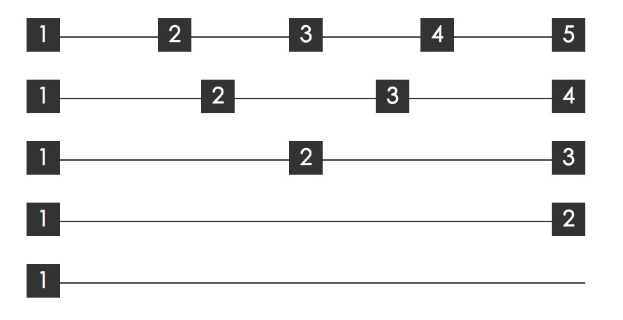
}多列均匀布局
如下图这样均匀布局
方法一:display:flex
这种方法上面也讲过,实现起来比较简单,适合移动端布局。
方法二:借助伪元素及 text-align:justify
html代码如下:
<div class="container">
    <div class="justify">
        <i>1</i>
        <i>2</i>
        <i>3</i>
        <i>4</i>
        <i>5</i>
    </div>
</div>
css代码如下:
.justify{
  text-align: justify;
  text-align-last: justify; // 新增这一行
}

.justify i{
  width:24px;
  line-height:24px;
  display:inline-block;
  text-align:center;
}
text-align-last兼容性不是很好,可以使用::after,
.justify{
text-align: justify;
}
.justify i{
width:24px;
line-height:24px;
display:inline-block;
text-align:center;
border-radius:50%;
}
.justify:after {
content: "";
display: inline-block;
position: relative;
width: 100%;
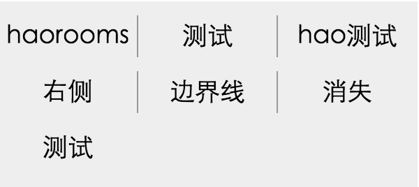
}列表布局边界线问题
如下图:
方法一:margin负边距
思路:
外层设置width,overflow设置为hidden,内层设置负边距,margin-left:-1px;就可以把左侧边距隐藏
html代码如下:
<div class="ul-container">
    <ul>
        <li>haorooms</li>
        <li>测试</li>
        <li>hao测试</li>
        <li>右侧</li>
        <li>边界线</li>
        <li>消失</li>
        <li>测试</li>
    </ul>
</div>
css代码:
ul{
    width: 300px;
    margin-left:-1px;
}

li{
    float:left;
    width:99px;
    line-height:30px;
    text-align:center;
    border-left:1px solid #999;
    font-size:18px;
    margin-bottom:10px;
}

.ul-container{
    width: 300px;
    margin: 50px auto;
    overflow:hidden;
    background: #eee;
    padding:10px 0;
}
方法二 :使用伪类选择器
// 使用伪类选择器,选择第 3n 个元素去掉边框
li:nth-child(3n){
  border-right:none;
}
css和html5实现展开收起下拉效果
这个请看文章:http://www.haorooms.com/post/zhankaishouqigengduo
CSS改变输入框光标颜色
caret-color属性可以改变输入框插入光标的颜色,同时又不改变输入框里面的内容的颜色。
input {
    color: #333;
    caret-color: red;
}
光标颜色是红色的,文字是灰色的。
综合兼容解决方案:
input {
    color: #333;
    caret-color: red;
}
@supports (-webkit-mask: none) and (not (cater-color: red)) {
    input { color: red; }
    input::first-line { color: #333; }//不支持多行
}
CSS中的计数器
用 counter-reset,结合counter-increment和content,可以做一些简单的计算。例如如下图:

<!-- html -->
<div class="languages">
  <input id="c" type="checkbox"><label for="c">C</label>
  <input id="C++" type="checkbox"><label for="C++">C++</label>
  <input id="C#" type="checkbox"><label for="C#">C#</label>
  <input id="Java" type="checkbox"><label for="Java">Java</label>
  <input id="JavaScript" type="checkbox"><label for="JavaScript">JavaScript</label>
  <input id="PHP" type="checkbox"><label for="PHP">PHP</label>
  <input id="Python" type="checkbox"><label for="Python">Python</label>
  <input id="Ruby" type="checkbox"><label for="Ruby">Ruby</label>
</div>
<p class="total">
  Total selected:
</p>

.languages {
  counter-reset: characters;
}
input:checked {
  counter-increment: characters;
}
.total:after {
  content: counter(characters);
}
注:characters 是自定义的。
如下图:

还可以做计算
<!-- html -->
<div class="numbers">
  <input id="one" type="checkbox"><label for="one">1</label>
  <input id="two" type="checkbox"><label for="two">2</label>
  <input id="three" type="checkbox"><label for="three">3</label>
  <input id="four" type="checkbox"><label for="four">4</label>
  <input id="five" type="checkbox"><label for="five">5</label>
  <input id="one-hundred" type="checkbox"><label for="one-hundred">100</label>
</div>
<p class="sum">
  Sum
</p>

.numbers {
  counter-reset: sum;
}

#one:checked { counter-increment: sum 1; }
#two:checked { counter-increment: sum 2; }
#three:checked { counter-increment: sum 3; }
#four:checked { counter-increment: sum 4; }
#five:checked { counter-increment: sum 5; }
#one-hundred:checked { counter-increment: sum 100; }

.sum::after {
  content: '= ' counter(sum);
}
一像素边框
@mixin thinBorder($directionMaps: bottom, $color: #ccc, $radius:(0, 0, 0, 0), $position: after) {
    // 是否只有一个方向
    $isOnlyOneDir: string==type-of($directionMaps);

    @if ($isOnlyOneDir) {
        $directionMaps: ($directionMaps);
    }

    @each $directionMap in $directionMaps {
        border-#{$directionMap}: 1px solid $color;
    }

    // 判断圆角是list还是number
    @if(list==type-of($radius)) {
        border-radius: nth($radius, 1) nth($radius, 2) nth($radius, 3) nth($radius, 4);
    }

    @else {
        border-radius: $radius;
    }

    @media only screen and (-webkit-min-device-pixel-ratio: 2) {
        & {
            position: relative;

            // 删除1像素密度比下的边框
            @each $directionMap in $directionMaps {
                border-#{$directionMap}: none;
            }
        }

        &:#{$position} {
            content: "";
            position: absolute;
            top: 0;
            left: 0;
            display: block;
            width: 200%;
            height: 200%;
            transform: scale(0.5);
            box-sizing: border-box;
            padding: 1px;
            transform-origin: 0 0;
            pointer-events: none;
            border: 0 solid $color;

            @each $directionMap in $directionMaps {
                border-#{$directionMap}-width: 1px;
            }

            // 判断圆角是list还是number
            @if(list==type-of($radius)) {
                border-radius: nth($radius, 1)*2 nth($radius, 2)*2 nth($radius, 3)*2 nth($radius, 4)*2;
            }

            @else {
                border-radius: $radius*2;
            }

        }
    }

    @media only screen and (-webkit-min-device-pixel-ratio: 3) {
        &:#{$position} {

            // 判断圆角是list还是number
            @if(list==type-of($radius)) {
                border-radius: nth($radius, 1)*3 nth($radius, 2)*3 nth($radius, 3)*3 nth($radius, 4)*3;
            }

            @else {
                border-radius: $radius*3;
            }

            width: 300%;
            height: 300%;
            transform: scale(0.3333);
        }
    }
}
使用:
单侧边框
生成.border-top-1px等4个单侧边框;
@each $dir in (top,right,bottom,left) {
  .border-#{$dir}-#{1}px {
    @include thinBorder( $dir);
  }
}
生成"红色"的多侧边框
  .border-top-left-red-1px{
    @include thinBorder((top,left), red);
  }
生成带100px圆角的边框
  .border-top-left-red-1px{
    @include thinBorder(top, red, 100px);
  }
使用:before去生成边框
  .border-top-before{
    @include thinBorder(top, red, 0, before);
  }